Badge. User Analysis. Wireframe Wizard.

PDF Deliverable

Image

This was actually a lot of fun. I worked on this with Aly (well, she was on a computer beside me while I kept nagging her if this feature looked okay or that feature looked horrible) and I enjoyed the freedom of being able to try something relatively easy then scrapping everything when I find out it doesn’t actually work.

I don’t think I’ll ever make a website now without doing some sort of mockup through wireframes because it just streamlines the entire process. The image in my head is clearly defined on the image file and all I have to do is basically recreate it in code. 

Gah. Last. Badge.

*dies*

Badge. User Analysis. Mobile UI.

The PDF deliverable

Creating the mobile UI was as difficult as creating the regular wireframe since the options are seemingly more endless than coding HTML. Doing wireframes, only my imagination is stopping me (a big stumbling block). 

I really think creating wireframes is a really smart thing to do before one actually starts coding. It’s good to have the vague image of a site in one’s head displayed into an actual image, however bare-bones it is.

Image

Badge. Coding. Css: Frameworks.

My three pages (different layout):

Image

Page 1

Page 2

Page 3

I didn’t really understand this whole CSS Frameworks thing. I had to read a lot of random blog posts till it somewhat clicked. Not really. I just mostly copied the information the examples on said blogs and then I started playing around with it. Oh my god. It’s confusing at first to think about using HTML to format how things are displayed since Dr. Delwiche has beat us “style with CSS” the whole year but there’s something clean about figuring out layouts (positioning to me seems more structure than style) through html then doing all the actual styling with another CSS.

 CSS Frameworks really makes me realize how important wireframes are (one of the other badges I’m doing. Go synergy!). During this badge work, I moved stuff around so much and broke everything since every little change in the CSS having to do with margins or paddings would automatically misplace elements in the grid. It literally took me hours to figure out the alpha and omega thing (nesting is tricky) and all of the prefix and suffix classes. Finally, I got it to work and it’s sort of like magic. I love how flexible it is manipulate the elements in an HTML page.

I haven’t done this much arithmetic in years! Other limitations seem to be that there’s less control with paddings and margins. By “seem,” I mean there’s no control whatsoever. Like 1 pixel alteration with CSS will throw everything off. That’s why I’ve settled with using a DIV tag inside the div tags as a way of adding filler. I just change the padding of the DIV inside the DIV and it actually works. I’ll know what to do when I use 960 for the ACM site. Margin-left and margin-right is now officially extinct for me because of this. It might be harder to edit stuff since I’d have to go through all of an HTML file to change the structure but it streamlines the whole process if I just do it right the first time (go handy-wireframes).

The public domain book I chose was Dracula so, of course, the pictures I put was Abraham Lincoln: Vampire Hunter. My header was blue, red and white in celebration of the Avengers movie! I’m currently sitting in the theater with a million people around me waiting for the movie to start. 40 minutes left!!!

All the frustrations of learning something new aside, this was so much fun! I can’t believe how much power I have over where elements are displayed just with some simple addition and subtraction. All right, I really have to go now though. I have to get a refill for the trough of a popcorn bucket now.

Badge. Power User. UNIX.

Ubuntu Screenshots!

ImageImageImage

I already had Ubuntu installed on my laptop since I wanted to do the Web Server badge (which I’ve now decided against). On the first installation of Ubuntu, everything worked just fine but I actually broke my laptop to a degree where I had to send it to Dell. Now, I think I’m pretty good at troubleshooting bugs and errors but I couldn’t even install a new OS. I somehow broke my BIOS (I think I messed up my hard drive) since I was messing around with the partitions because I found out I had like 100GB of unpartitioned space. I ended up destroying my BIOS, having to send in my laptop (two weeks before the warranty expired) and crying my eyes out. All for Web Design (does sympathy points get me extra credit?). But now! I’m back and ever better! I reinstalled everything fresh so both Windows and Ubuntu are running perfectly. Btw, installing Ubuntu, for anyone interested, isn’t the easiest thing in the world. You have to set up your own partitions, multiple partitions, for different directories. I had to look up what was what and what I should save for each. Not like Windows where the only real input you have is changing the time zone. Haha.

Most of the software that I had to install for this badge was downloaded through the Ubuntu Download Center. It’s sort of the iTunes store of Ubuntu. Instead of dealing with packages and tar and all that, it’s a pretty simple point-and-click UI.

As someone who loves video games, it’s encouraging to see that Linux distributions are getting some love from game developers. I’m happy to see that the great indie games of Windows, a lot of which I was under the assumption that they were only on Windows, are also for Linux. Games may seem trivial but I think it bodes well for Linux (especially Ubuntu, the most mainstream of the distributions) when popular games are being developed on Linux. It gives the OS more credibility. Playing games is one of the most often heard complain about switching from Windows to Linux. The gap feature-parity is ever closing while Ubuntu is still maintaining it’s own identity.

Also, just as a side note, Eclipse, the program we use to program for my programming class, works exceptionally well in Ubuntu. On Windows, it’s a messy, buggy, slow and unreliable software that’s more headache than anything else. It’s another reason to install Ubuntu. It’s great to program with.

P.S. I wish I could change the username! I accidentally misspelled my own name and Ubuntu always displays the username on the bar on top so it’s always some guy that isn’t me.

P.P.S. This was in the UNIX instructions:

In a short (4 to 6 paragraph) posting on your personal blog, discuss your experience with Linux. What difficulties, if any, did you encounter? Can you share any tips or tricks with others who might pursue this badge? After experimenting with Linux for a while, what’s your take on the operating system? Be sure to include the before/after photos of the silhouette as well as the before/after photos in step 7. When finished, please send a short e-mail with the subject line “Pending. Power User: Linuxl” to adelwich@trinity.edu.

Badge. Industry Analysis. Tech Podcast.

http://itunes.apple.com/us/podcast/podcasting-with-john-and-aly/id523952489

Here’s the 3 episodes of my collaborative podcast with Aly Miller (it would have been a tragically boring podcast with just me). We talk about cloud computing: the past, the present and the future of it! 

So this was probably the most fun I had working on these badges. I think collaborating with someone really helped enhance the experience. I hope someone other group decides to do a podcast. It’s not that difficult. If someone does, can you put up all the links or something! Haha. I’d be interested in listening to the other folks in class.

We go through a myriad of topics from the Kindle, Google’s Chrome OS, Dropbox (always awesome and amazing), Aly’s hate for eBooks, Virtual OS, cloud hosting services, etc… Surprisingly, I’d say that the podcast actually turned out to be informational as well!

I’m listening to the podcast while I do my other badges. It’s so weird to think that I’m on the iTunes store! I’M FAMOUS!

P.S. Sorry for all the parts where I talk.

Badge. Entrepreneurship. Domain Hosting.

NOTE: I’m continually changing where the domain points to and the stuff within so I’m sorry if it might not work all the time. As I do each badge, I’m trying to incorporate it to the acm page so I’ll be (hopefully) making lots of updates!

http://acmtrinity.com

Image

So I went with godaddy.com. Please, before the pitchforks come out and into me, let me explain! I understand that everything about GoDaddy is shady and obnoxious like nobody’s business. I promise that I had a somewhat good reason. Yes, their website is atrocious with crammed, intimidating design being the number-one design goal. Though, to be fair, some of the other hosting services I saw had similarly terrible design. It seems that the people in charge of the handles for internet sites don’t actually ever visit internet sites. GoDaddy is also known to be socially and politically in the deep end (the crazy, misogynist part of the pool), but they do offer some ridiculously cheap domain names. I’m sorry that I was weak and caved in to the financial allures, but I almost have a negative number in my bank account and I really wanted a domain name and GoDaddy was the cheapest solution to my domain woes! Also, I’ve used them before back in my high school days (I made a website – well, pointed the address to a blogger page – for my girlfriend on Valentine’s Day!) so I know how to navigate and use their labyrinth of a page.

I have now created multiple emails! They are… johnmendiola@acmtrinity.com (my cool, personal email. How exciting!), alyreallytrulysucks@acmtrinity.com (this one is forward to Aly Miller’s email account), vicepresident@acmtrinity.com (my position) and web@acmtrinity.com (for issues about the page).

The problem that I did encounter is how to configure the URL so that the domain points to a server. Previously, I’ve scraped by by using URL forwarding which isn’t a terrible option but it isn’t the same as attaching the domain name to a server. I played around with the convoluted and god-awful site options (where at least like half of the options were just buttons I could click that would sign me up for some other service that I’d have to pay for) until I finally encountered something called a DNS manger. Here I found the tools to link my server (whenever I get one) to my domain name. Sadly, I don’t have a server (no IP address) so, for the meantime, I’ve forwarded the domain to a placeholder server. I turned masking on so that the domain name I purchased will be the only thing that shows up even with the domain forwarding. It’s ostensibly as good! I doubt anyone would notice the forwarding. I do plan on getting a server at some point but I’m also trying to see if the CS Department will lend me some space on theirs so it all isn’t decided yet. It all depends! I hope the work I put in the website makes them want to actually use it.

If I had more money, I would definitely choose another hosting service. Probably would be namecheap.com since it’s cheap yet the services seem quite good for the price. I don’t ever see the site become anything more than a couple of pages so I doubt we’d need anything more substantial tools and services.

P.S. I couldn’t see if this was true for most domain hosting but the default setting for my account (so address, phone number, email) was public and I had to pay a yearly charge for it to be set to private. How horrible of a service!

Badge. Power User. Photoshop: Pen Tool.

Here’s the Before image for the silhouette! Go Avatar Korra!

Image

Here’s the After image for the silhouette! Go Avatar Korra!

Image

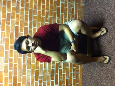
Here’s the image I want to insert into… (see next image)

Image

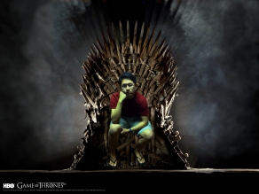
By the end of this blog post, I shall sit the Iron Throne. Woe to the pretenders.

Image

Mwahaha. I am the king and ruler of the Seven Kingdoms!

Image

Do people actually read? Why??? There’s pictures on top, there shouldn’t be so much text on the bottom. I guess if I really have to write up something for this then I should…

So I realized that I’ve actually used the pen tool before, but I also realized that I didn’t really use it that well. Starting this assignment after reading the few articles and watching the video, I still didn’t understand it. My first work was with the silhouette assignment and my lack of pen tool expertise is obvious. Most of the shape of the Avatar is sharp and edgy. There aren’t many curves because I mostly relied on making small, straight lines to go around the shape. 

I really got the hang of the pen tool by just playing around with it. I made an unrelated image to the project that I sent to my friend because she wanted some image for a birthday card. That was a lot of fun and then I started on the insertion portion of this badge.

At the moment, the two images I used in this badge are the two things I am most obsessed over. I have now read the 5 books of A Song of Ice and Fire (and you should too!) and the three novellas (set 100 years before), yet I still think of that world every single day. There are so many questions unanswered but the most important question is: who will sit on the Iron Throne? Well, I thought I’d answer that! 

I, John Mendiola, will ultimately sit the Iron Throne. The most obvious problem was cutting my picture out. It was a tedious process but pretty self-explanatory. A problem that I did encounter that I really didn’t thin about at first is the coloring and light of my image compared to the Iron Throne image. Coloring and light makes or breaks an image, more than anything else, I think. It’s one of those giveaways if an image is photoshopped or not. I played around with a bunch of filters, color settings and saturation settings to get my image as close to the colors of the Iron Throne image.

One other thing I had to work around is getting my picture just right. Shooting the photo wasn’t that easy because I had to find a friend (hard part) then get her to keep looking back and forth to my computer screen (where I had a picture of Sean Bean sitting on the Iron Throne) then to me. I wanted her to make sure the angle and level was correct before she took the picture. One part that I didn’t account for is the chair height. Of course, now that I think about it, the Iron Throne is a higher seat than the chairs in the Prassel study lounges. Haha. I just resorted to moving my image up, my legs dangling, because I already did all the work so it wouldn’t be worth all that extra effort!

This was fun. Now I don’t want to do my other badges and I just want to keep working on more photoshop shenanigans…

Badge. Graphic Design. Logo Maker.

To: ACM – Trinity Chapter
From: John Mendiola
Date: April 30, 2012
Subject: ACM Logo Review

Here’s the final logo for ACMImage

I’m sending this memo as a review of the process I went through to design the
logo.

I started brainstorming themes or elements that would fit the organization. ACM
– Association for Computing Machinery – caters mostly to individuals who are
mostly deemed as “nerds.” Of course, such wide swaths can’t cover every single
person in the organization, but I reasoned that it would be good enough just for
a simple logo.

Going for this highly-referential, nerd culture route proved to be more
problematic than I expected. One, it proved impossible to decide which elements
would go into the logo. I envisioned a field of binary bits encompassing the
entire square while a pair of blaster was immediately in front, forming an “X”
while the letters A-C-M was at the very foreground. There were a lot of issues
with this initial idea. It was really complicated, busy, crowded and confusing.
There wasn’t really an exact message, just sort of a bunch of “nerdy” references
thrown together. I think it would have been interesting to make though I
question the effectiveness of such a logo to represent your entire organization.
The nerd-centric aspect of the design might also put off a lot of people
especially since the goal of the organization is to try to recruit more people –
the logo being so niche might prove to just alienate people. Second, the
conflicting colors and images imposed on top of each other made it that no
element ever caught the user’s attention. I thought it would be better to go
with something simpler that would deliver a more concise message, something that
can be noticed with only a momentary glance. So I scrapped the complicated
design that tried to cram everything into a small box and kept on brainstorming
of other ideas.

I went with something simpler and thought of just leaving the field of binary
bits and making it all 0’s then the 1’s inside would form the letters A-C-M.
This proved to be problematic as well since the design of the website in general
will have a lot of maroon and generally any other color than green. Another
problem was the difficulty of some of my test cases having difficulty trying to
make out the ACM. With a logo being a pretty simple and subtle element of a
website, it might not be inherently simple to see the acryonym that the 1’s are
supposed to make. Aside from all those problems, it just wasn’t that comfortable
to read. It made me personally dizzy by staring at the logo so much. Nausea is
definitely a terrible side effect of a design!

I had trouble with coming up with something else so I thought I’d take a break
from trying to force an idea; instead, I had some fun imagining slogans for the
organization. One of the actually made it to the final design. There are
versions with and without the slogan in case you would like to incorporate your
own punny slogans or just want a blank logo. Anyways, this exercise was a fun
distraction and I thought of an idea while doing this…

Now the idea I eventually settled on, something simple, clear and informative! I
thought of some image that people associate with an organization that focused on
computers without delving into stereotypes or anything like that. Of course! It
was right in front of me! A computer! What if the letters A-C-M were displayed
on a monitor? It would be pretty simple to create the monitor itself since I
wasn’t making a 3D model. I used the color maroon to fit the color scheme of the
overall website better. I put Trinity, your school, instead of a manufacturer’s
name since it would lend the monitor more believability if there was a word
there and Trinity would deliver information as well! The final design turned out
to be better than any of the other designs I thought of. It may not be as
elegant as the tutorials but an arbitrary brush stroke or cool image wouldn’t be
as concise as the monitor displaying information.

Have a good day!


Badge. HTML Intermediate.

My HTML Page!

Here’s a screenshot of my webpage! Super awesome!

Image


Doing this after the javascript project was the best thing ever. Not that I used javascript on it, it’s just the difficulty of the two assignments were REALLY noticeable. This was a pretty fun assignment to work on. And it’s one of the only assignments in this class where I didn’t have to look anything up on the internet (aside from the content, that is). 


On to work on those other 8 badges now before I fail the class….

Mini-Site #3

http://transmedia.trinity.edu/~jmendiol/site3/screenshot.jpg (Screenshot)

http://transmedia.trinity.edu/~jmendiol/site3/scroogle.html (Mini-Site #3)

Keywords: sketchy, janky, shady

I’m done. I guess. Haha. I’d just like to apologize for it not being pretty at all! With fixing all the janky javascript shenanigans and playing around with what I can do (super cool) and my other professors demanding projects at the same time, I didn’t have as much time as I would have liked to make it

Basically, the basic theme is a shady Russian site. To any Russians out there, I apologize profusely. I was going to make a boring, functional website but I horribly butchered one of the questions on my site and I got the brilliant idea to make EVERYTHING horribly butchered. I really had fun being completely silly and writing the things that are completely sketchy. If I had more time, the thing I would definitely do is make the sites more obnoxious, a lot like the actually shady, potentially harmful websites out there.

Next project: Nigerian Prince official website?

The javascript portion of this Mini-Site was the hardest part. It may not seem like it with the somewhat unsophisticated CSS but I spent a lot of time working on the functional part of the site. Javascript proved to be REALLY and specific which was really frustrating. I feel like most of the code I wrote was completely useless and now gone. A stray quotation mark or parenthesis took minutes and hours of my life. In the end, I definitely really enjoyed having the power to change stuff on the fly though. I want to learn more than just document.getElement if I have a chance (hopefully, this summer after all of the work this semester).

🙂

Previous Older Entries